COLOR SEPERATION: The Different Processes
taken from my contribution to printwear magazines online articles found here
The first fact that came to mind when breaking down color separations: technology is making color separation easier.
If you think about what seps looked like 30 years ago versus today, it's a world of difference. The continuing trends in automation and software will continue to expand on itself and technologies, and trends will roll along with it.
Why is that important and what do I need to actually know? Well, It's important because you can now use Photoshop plugins and standalone programs to do some pretty impressive color separations (seps). Not only that, but they are fairly affordable, even for home businesses that are just starting. In many instances, Photoshop basics are all you really need to output stunning seps. These are especially handy when it comes to process and simulated process jobs where images are more photorealistic in design.
The second fact that came to mind: there are vast online resources to learn about separations.
If I was to go into detail here on how to separate, I would have to write a book. YouTube has a large number of tutorials online to help with separations. However, if you would like a little more structure like me, head over to sites like Skillshare.com and take all the Photoshop and Illustrator classes they offer. Learning all the basics and how to navigate will make your life easier as you dive deeper into separations. I oftentimes find myself taking beginner courses for refreshers on things like hotkeys and process flow. You can never stop learning.
Before you start going to other websites or looking at art, make sure you know the types of separations there are. I mentioned some of them already. Here is a brief synopsis of the main different types of separations.
Spot Separations: This is the most common type of print and separation you will have to do at a print shop. These are designs with a limited pallet and, most commonly, large areas of individual fill colors. Ideally, these will be supplied or made in Illustrator or a similar vector-based program. If it is vector art, you may just need to resize appropriately and separate the colors out into spot colors.
Vector: This is art created in a vector illustration program that uses points, shapes, and lines to create art with clean edges and is scalable without loss of quality.
Raster: This is also referred to as bitmap. This art is created in programs like Photoshop or any Paint program. Raster art is made of individual pixels. This means that if you zoom in really close on your computer, the edges begin to distort and you will not have as clean of lines as you would with a vector.

(Image courtesy the author)
If your art is created in a bitmap program but is a solid area of color or shapes, you can output just fine as long as it's created at size. If you need to change the size, I would highly recommend recreating the artwork to be vectorized or ask the customer to do it if they are able. There are also lots of outsourcing options online to get things vectorized that are very affordable and can come in handy if you aren't able to do it yourself, but you should try to learn when you can.
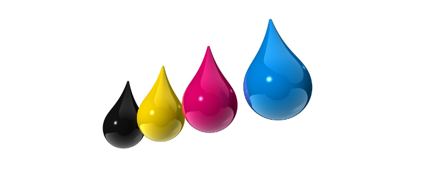
Process Separations: Process separations are using the CMYK color model. This uses halftones and overlays semi-transparent dots made up of cyan, magenta, yellow, and black process inks to give the appearance of a full-color spectrum (see below).
This is a printing method used most frequently for photorealistic images that are created at size in a raster program such as Photoshop. Think of this as one of the go-to's when printing pictures of people. This is also how most all paper and digital printers print as well. Using a rosette pattern to create the full spectrum of color.

Simulated-Process Separations: Over the last few years this has become the top used separation method. This process uses halftone patterns similar to process printing, but uses solid areas of ink and accounts for some ink blending when printing in a way that when you look at them, it shows the appearance of other colors. See the image below to get a better idea of what this looks like.

Think of it this way. If you take a square and break it up into tiny pixels and made every other one yellow and red, when you zoom out it looks orange. That is a very rudimentary way of thinking about this, and technically not how it's done. It's a mathematical equation that breaks up into random sequences of halftones to give a large color spectrum appearance. Using solid colors and halftones make it slightly more predictable how the image will look when printed. If a color is off, it's easier to adjust by swapping out the color you don't like, whereas with standard process printing it is dependent on many more variables. Often times this separation can use the same pallet of anywhere from five to nine colors. These can be switched and adjusted in the art separation process to help true colors stand out.
If all of that was a little confusing, the main takeaway is that most shops nowadays are completely fine with just having the basics of Photoshop, Illustrator, Corel, or similar programs and utilizing software to help with more advanced separations. If you want to take your separations to the next level, start testing and playing with different types of separations and adjustments. The shops and people that take the time to see what works best are the ones that succeed.
Keep playing, keep learning, and never stop testing and evolving! That's the true way to become a master.